
Reinvigorating HP Customer Support Assistant
ROLE: Design Manager / Design Owner
TEAM: 2x Product Designer, 1x Product Manager, 1x Engineering Architect
PROJECT LENGTH: Six Months (from start to Launch)
SUMMARY
This case study details the redesign process of the HP Support Assistant, HP’s customer support app. After a poorly received initial redesign in 2020, I joined the team and prioritized addressing internal criticism and understanding user behavior. I led the team through a heuristic analysis of the app, analyzed user data and customer sentiment, and created affinity diagrams to prioritize improvements. Despite limited resources for user research, the team used low-fidelity prototypes and gathered feedback from internal sources to iterate on the design. This user-centered approach resulted in a successful second launch and increased customer satisfaction scores. The case study demonstrates the importance of iterative design, data analysis, and user feedback in creating a successful product.
Turning a failed redesign into a user-centered product revival
HP Support Assistant, a critical touchpoint for HP customers, had just undergone a rushed redesign that backfired, alienating users and tanking satisfaction scores. Brought in during a time of crisis, I led the product design turnaround, focusing on team revitalization, data-driven problem-solving, and rebuilding trust through UX.

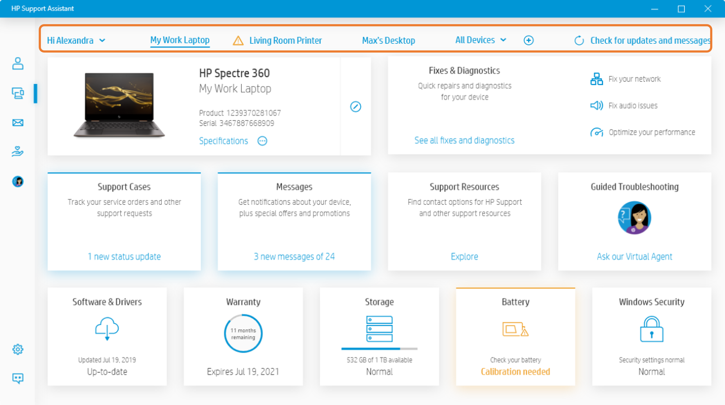
Before update
This was how HP Support Assistant looked before the visual update.

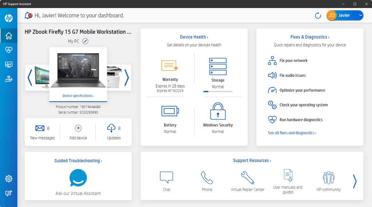
After update
The original direction for the update was to capture the feel of a “dashboard for your device.”
Challenge: A failed redesign created confusion and dissatisfaction.
NPS and CSAT nosedived post-launch.
Users described the app as “confusing” and “hard to use.”
Internally, morale was low, and design was viewed as a service team rather than a partner.
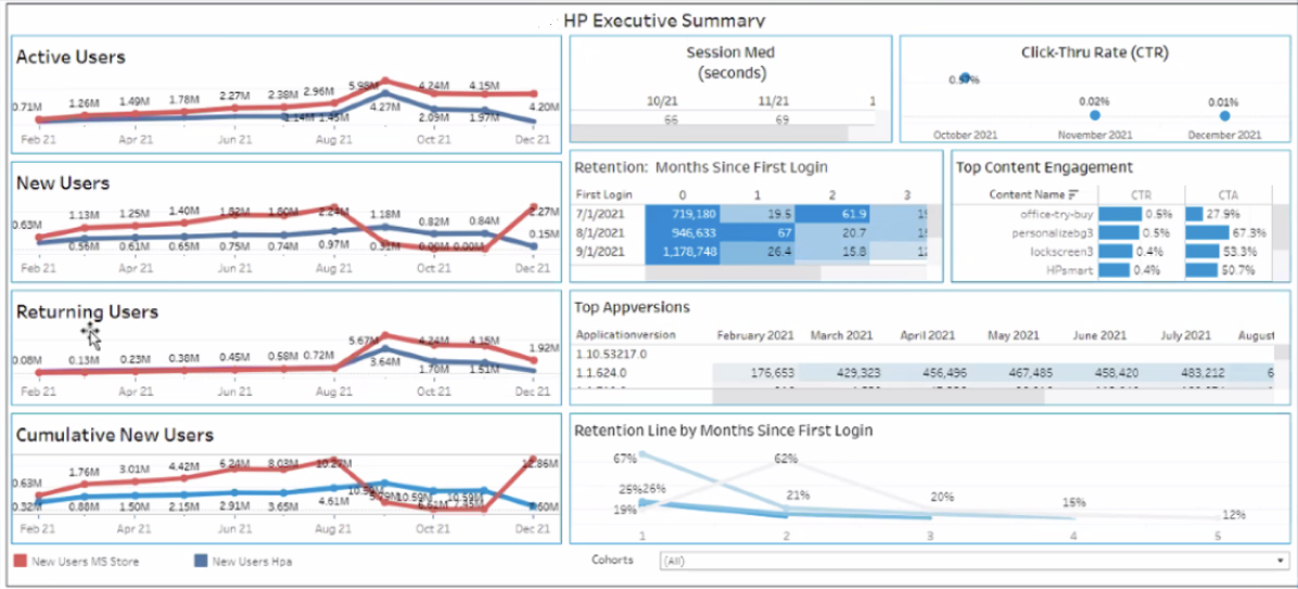
CUSTOMER SUPPORT – Metrics following launch
Rebuilding from Within
With a burned-out team and competing agendas, I started by shifting the mindset: from reactive victims of process to proactive problem-solvers. We adopted new rituals, shared work early, and rebuilt design's voice in product decisions.
I wanted the team to view this as a "community solution,” not just a design problem. To encourage this, I met with the core product and engineering stakeholders to hear their thoughts. While I let them vent for a little while, my focus for the meeting was to avoid more negative critiques and to create a constructive post-mortem to understand the decision-making process without dwelling on the negatives.

I took a different approach with the design team, knowing they had limited trust in me in my new role and in "management" for entrusting the task to an agency. While I conducted a similar exercise in one-on-one meetings, we focused on foundational tasks, such as heuristic analysis and understanding customer journeys and flows, when we met as a team.
As this was during the pandemic, working remotely was a new experience for us all. We used this as a chance for the team to develop new ways of working together by adopting Figma as our design toolset to encourage better sharing, awareness, and collaboration.
Research-driven Discovery
We took our data, which came in two forms. The first was the app's "usage" data to see how the redesign changed usage patterns because of the update. The other was customer sentiment, measured through our customer survey mechanisms. Both gave us a decent sense of what worked in the new design and where there were clear areas for improvement.
Making the Invisible Visible
We combined quantitative usage data with qualitative feedback. While some design decisions showed usage upticks, the why behind poor satisfaction became clear through direct observation and sentiment analysis.
Ideally, we would have conducted some UX research with users while performing these internal tasks to determine how close we were to accurate user feedback. However, we lacked UX research capabilities, which was another area we needed to improve.

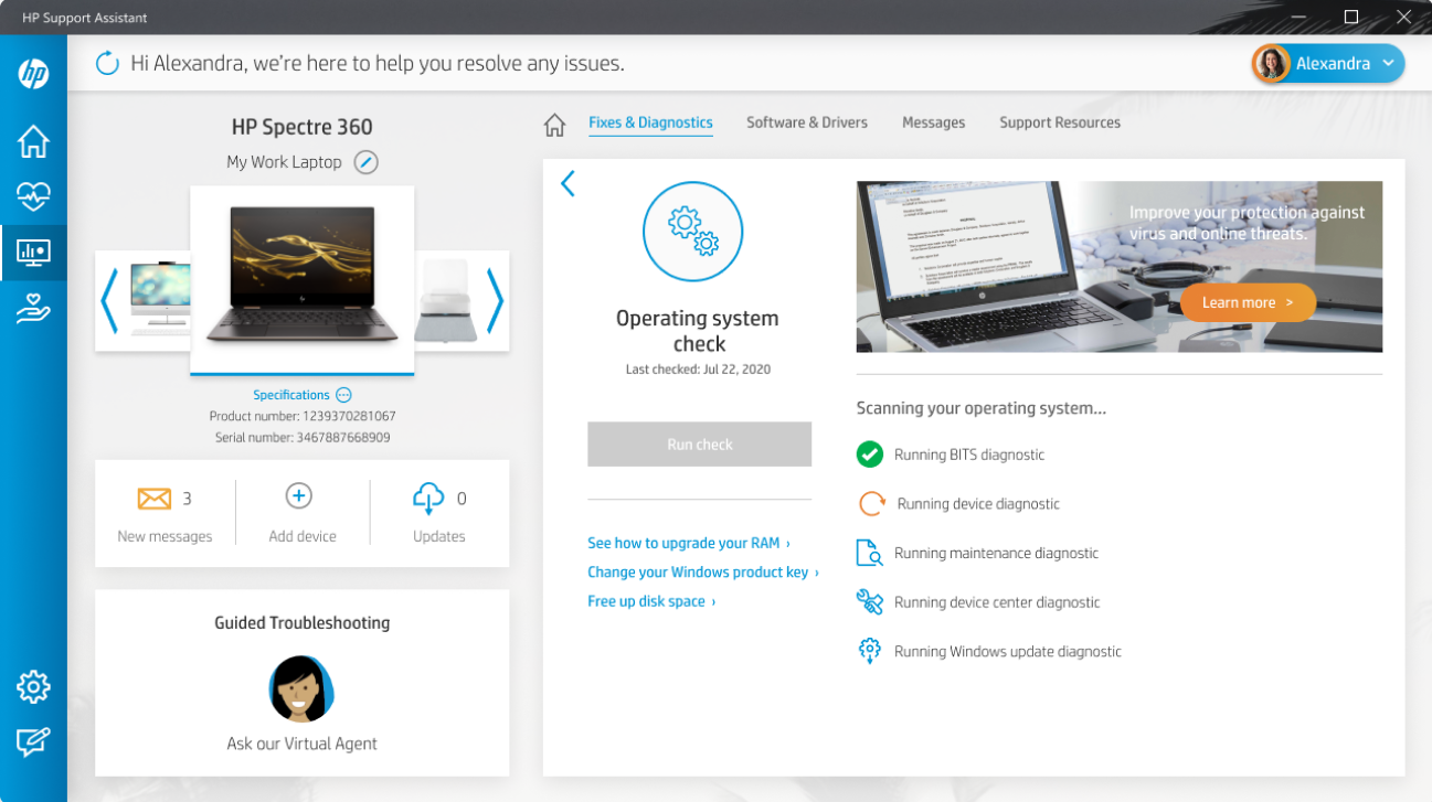
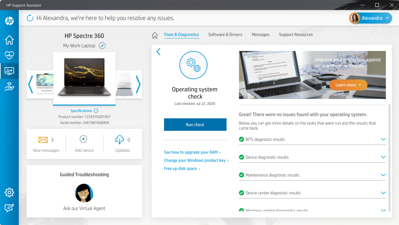
Iterative Redesign
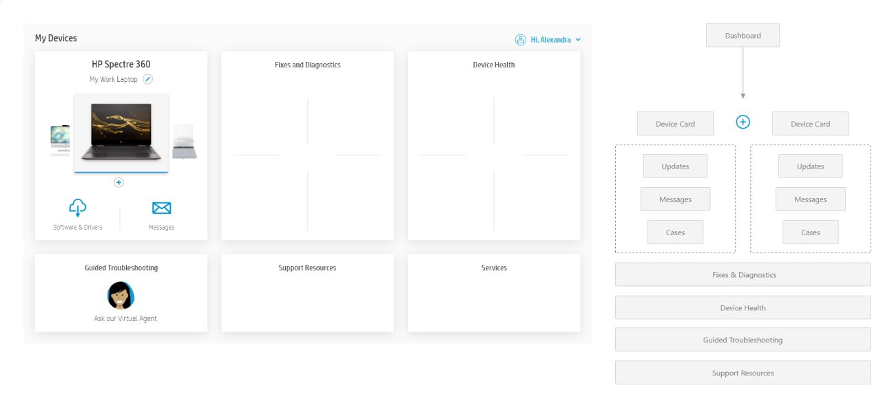
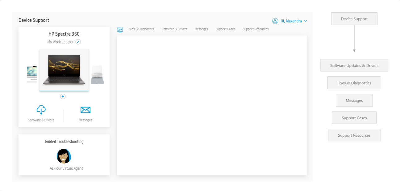
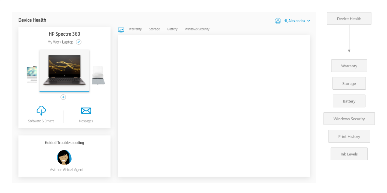
We took these findings and, working closely with our product team, created an affinity diagram that helped us prioritize a "wishlist" of actions for the app. Using the information from the affinity diagram, we sketched out a new information architecture to simplify the app's structure.
We took a similar approach to each significant section of the app. We used customer journeys to understand the steps needed to use a feature and low-fidelity wireframes to explore layout and flow changes that would improve the app.
Given our limited UX research resources, we sought feedback both internally and from 'friends and family.' We used simple clickable prototypes to both show quick progress and gather data on whether we had effectively addressed the issues we set out to resolve. The feedback we received was overwhelmingly positive, creating excitement across the formerly cynical team.
The Agency Design that was performing poorly
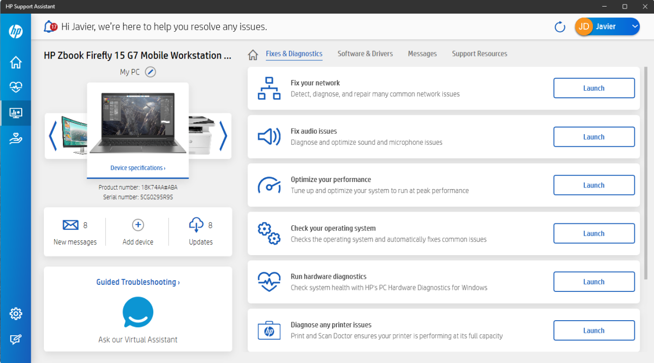
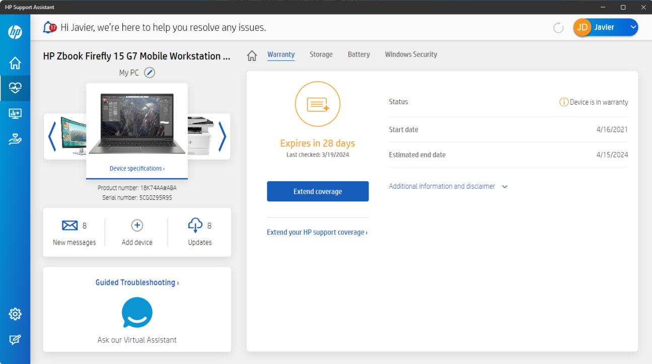
Our updated design featuring a new information architecture and other improvements
Typical Findings & Improvements
Problem One: Weighting of Options

PROBLEM: Scattershot of options didn’t match user needs and had poor affordance.

SOLUTION: Instead of a vertical visual hierarchy, we used a left-to-right mental model more familiar to PC Windows users.
Problem Two: Multiple Devices
PROBLEM: There was a significant drop in use in of “Add a new device”

SOLUTION: We relocated the add device to a more central location and positioned it with other more commonly accessed features.
Problem Three: Key Features & Purpose

PROBLEM: These were our most commonly accessed features, and they were hidden or placed lower on the screen.

SOLUTION: These features were consistent on every device, allowing for a cleaner mental model (core systems on the left, device-dependent options on the right)
Reimagined UX
When we presented our proposed changes to our executive management team, they were unanimous in their praise and lauded the proposal for its visual clarity and how quickly and thoroughly we had addressed the problems.

CUSTOMER SUPPORT – Metrics following launch
RESULT: No sign of the expected dip and CSAT improved above previous levels.
The gains were modest at first
The legs of the refresh were strong, CSAT continued to improve, exceeding the original pre-Agency update CSAT values within 6 months.
Customer satisfaction with HP Support Assistant has, on average, improved every year since.